Back to work
Figma App Prototype2025
ECC App
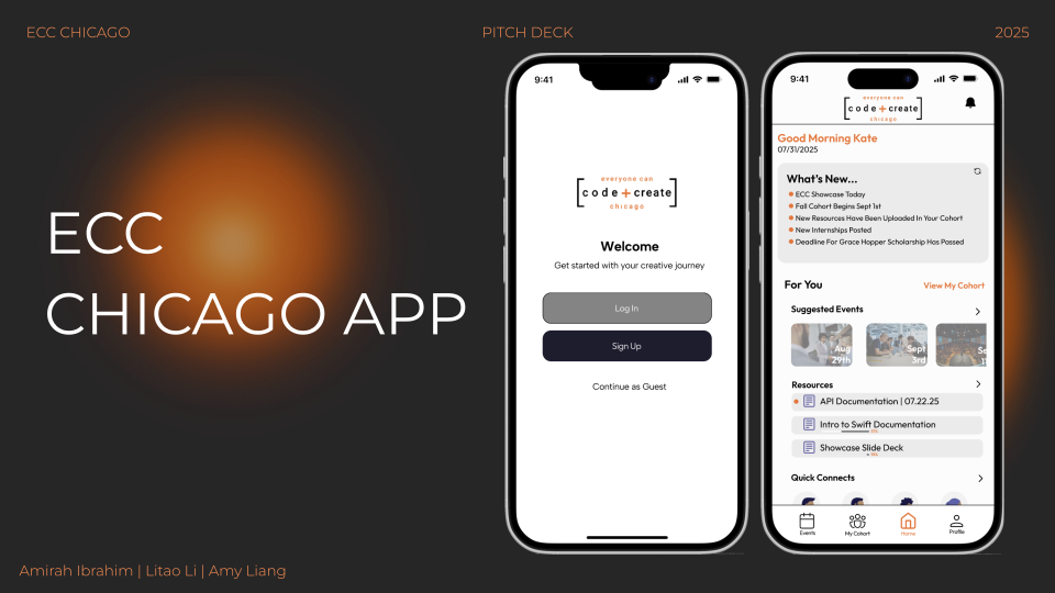
A mobile app designed to connect students, resources, and opportunities within the Everyone Can Code Chicago program.
- Role
- Mobile App Developer
- Timeline
- Jun. 2025 — Aug. 2025
- Tools
- Figma, Google Slides, User Research, Stakeholder Communication, Personas, Sitemap, Wireframing, User Flows, High-Fidelity Prototyping, Iterative Design
Overview
Despite teaching student interns how to build iOS applications each summer, Everyone Can Code Chicago had no app of its own. During my time as a mobile app developer, my team of three transformed a broad vision into a user-centered mobile platform that connected students, resources, and opportunities.
The Challenge
Although ECC equips students with technical skills, the lack of a dedicated platform meant that students had no centralized platform to access resources.
The experience once the internship ends is also scarce. Students often struggle to maintain connections with their peers and mentors after the internship concludes. These issues persisted across multiple cohorts, indicating opportunities for a more unified student experience.
Research
Understanding student pain points
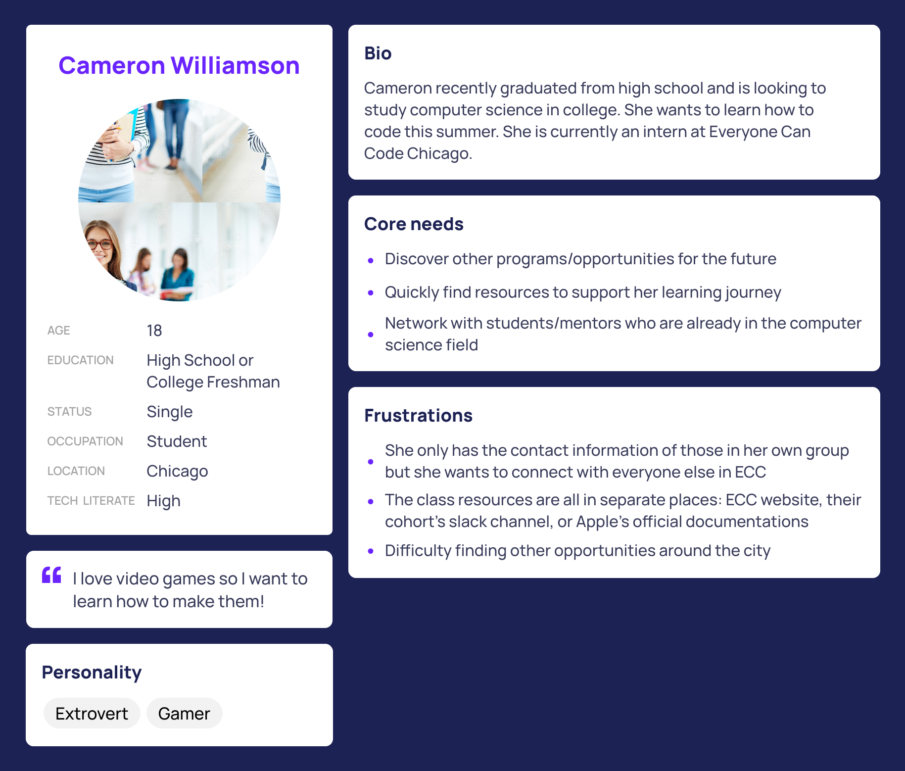
All three team members were program alumni, so we began by reflecting on our own experiences before validating them through discussions with students and the program director.
Across different cohorts from different years, four consistent themes emerged:
- Scattered & hard-to-find resources
- Weak community beyond individual teams
- Lack of guidance post program completion
- Lack of visibility into summer opportunities and events
These insights became the foundation for our design decisions.
Defining the Solution
We worked closely with the program leader—the primary stakeholder—throughout the project. During weekly check-ins, we presented our research findings, discussed feature ideas, and gathered feedback to ensure our design aligned with both student needs and the program's long-term goals.
These conversations helped us refine our priorities and narrow the app's scope to four core features that addressed the most common pain points identified during research:
- Centralized Resources - A single hub for recordings, documentations, and ECC-wide annoucements
- Community - Student, alumni, and mentor profiles to foster networking across ECC
- Opportunity Discovery - A dedicated space for internships, workshops, and other events around the city
- Project Showcase - A gallery of past projects to inspire future cohorts and highlight alumni work
By continuously incorporating stakeholder feedback alongside user research, we refined the app into a focused MVP that addressed the most pressing student needs. Features such as gamification and a forum page were deferred to future iterations, allowing us to deliver a clear, achievable product vision in the short amount of time we have while leaving space for future enhancements.
Information Architecture
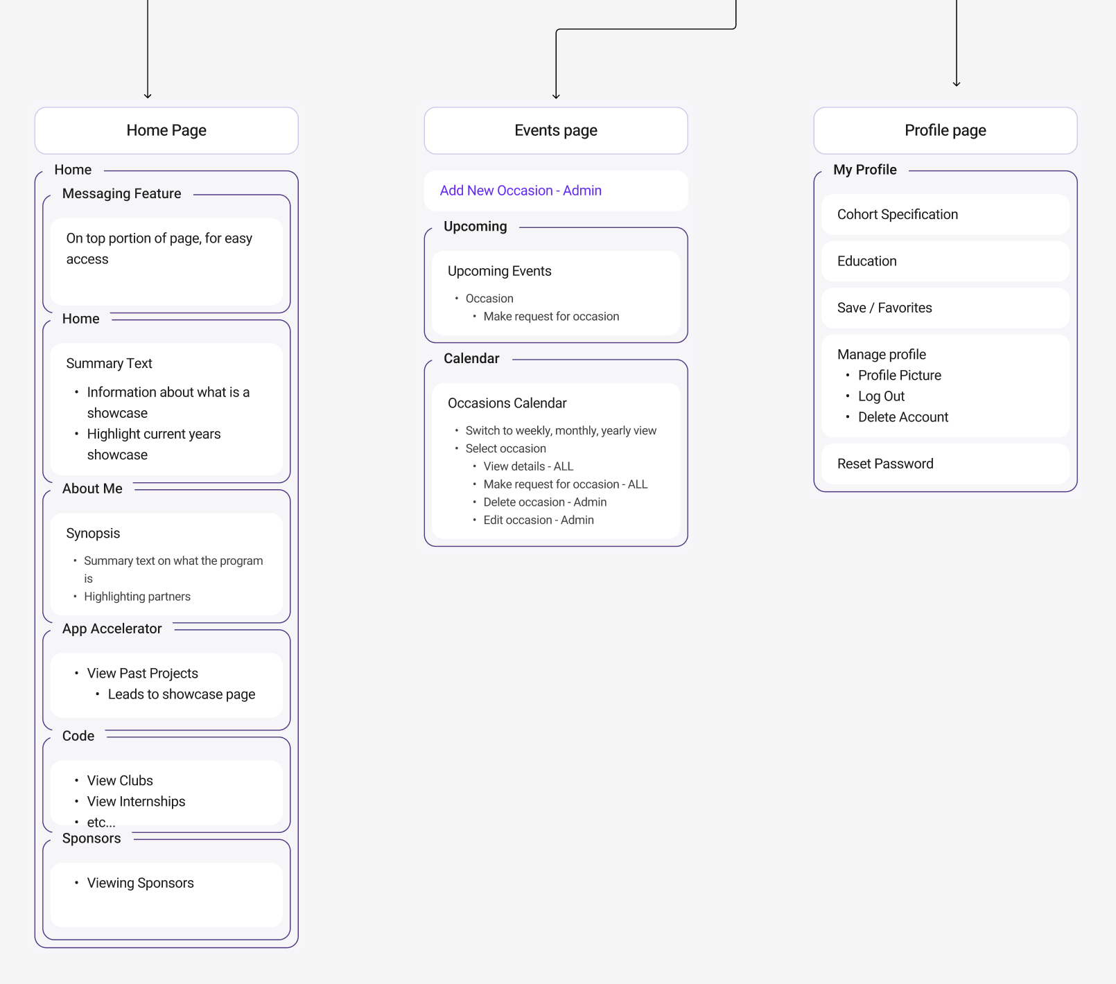
With the core features defined, we created a sitemap to visualize the app's structure. I designed the application's information architecture to organize content into clear, intuitive user journeys.
The navigation focused on four primary destinations:
- Home
- Cohort
- Events
- Profile
Supporting pages included authentication, private messaging, and resource libraries to minimize navigation complexity while keeping important information easily accessible.
Design & Prototyping
With the application's structure established, I shifted my focus to transforming the sitemap into a cohesive mobile experience. We wanted the app to feel like a natural extension of the ECC brand, so we maintained the visual identify of the program's website. Inspired by Apple's Swift branding, we carried over the site's vibrant orange accents, clean layouts, and minimalist aesthetic.
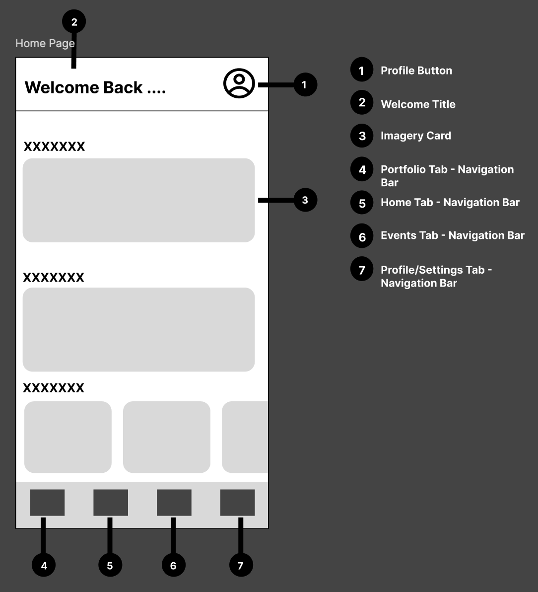
I began by creating low-fidelity wireframes to quickly explore screen layouts, content hierarchy, and user flows before investing in visual design. These wireframes served as a foundation for our weekly stakeholder meetings, allowing us to validate our design decisions early and iterate efficiently based on feedback, ensuring a smooth final product.
After refining the layouts, we developed a high-fidelity interactive prototype in Figma. To ensure consistency across the application, I established reusable UI components, standardized typography, and a cohesive color palette that aligned with the ECC website.
Explore the interactive prototype below:
Presenting the Final Design
The ECC App MVP was successfully delivered with a presentation to Apple executives, the ECC program leader, and other program alumni, where we introduced the research behind our design decisions and demonstrated the interactive prototype.
To create a cohesive experience, I desgined the presentation deck using the same visual language as the ECC aesthetic, incorportating a minimalist black-and-orange color palette, clean layouts, and modern typography to reinforce the project's identity.
The presentation sparked valuable discussions about the app's future, with stakeholders providing feedback that helped shape a roadmap for future iterations beyond our initial MVP.